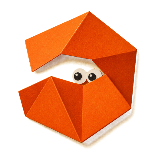

Website case study
Antisocial Norm
The design and build of this paper-world publishing space - playful in form, serious about reading, access and evidence.
Purpose
What it is for
Create a personal publishing space for essays, practical guides and projects without reproducing conventional personal-brand aesthetics.
Problem
What needs attention
A tactile visual identity can become decoration, chaos or nostalgia. The site needed to feel physically made while keeping serious writing calm, legible and easy to navigate.
Principles
- Paper is the material, not an overlay
- Playful form does not weaken serious thought
- Irregularity belongs inside a disciplined system
- Access requirements shape the aesthetic rather than being added later
Key decisions
- Use the formal brand kit as the source of truth
- Build with static HTML, central CSS tokens and minimal TypeScript
- Use transparent source-led character assets
- Stop autonomous motion on long-form pages and under reduced-motion preferences
Current state
Local website build with draft editorial content and complete core routes.
Safety information
The publishing system keeps draft status and unresolved evidence visible. Sensitive personal or casework material is deliberately outside this repository.
Support
The accessibility page explains the implemented behaviour and provides a route for reporting a barrier when a contact method is later confirmed.
Privacy
The static site uses no analytics, advertising, accounts, cookies or remote runtime services. Search runs in the browser against a local index.
Project notes
The physical motion system uses small lifts, hinge-like rotation and directional shadows. Torn edges mark major transitions rather than every component.